Biking: Artist Statement

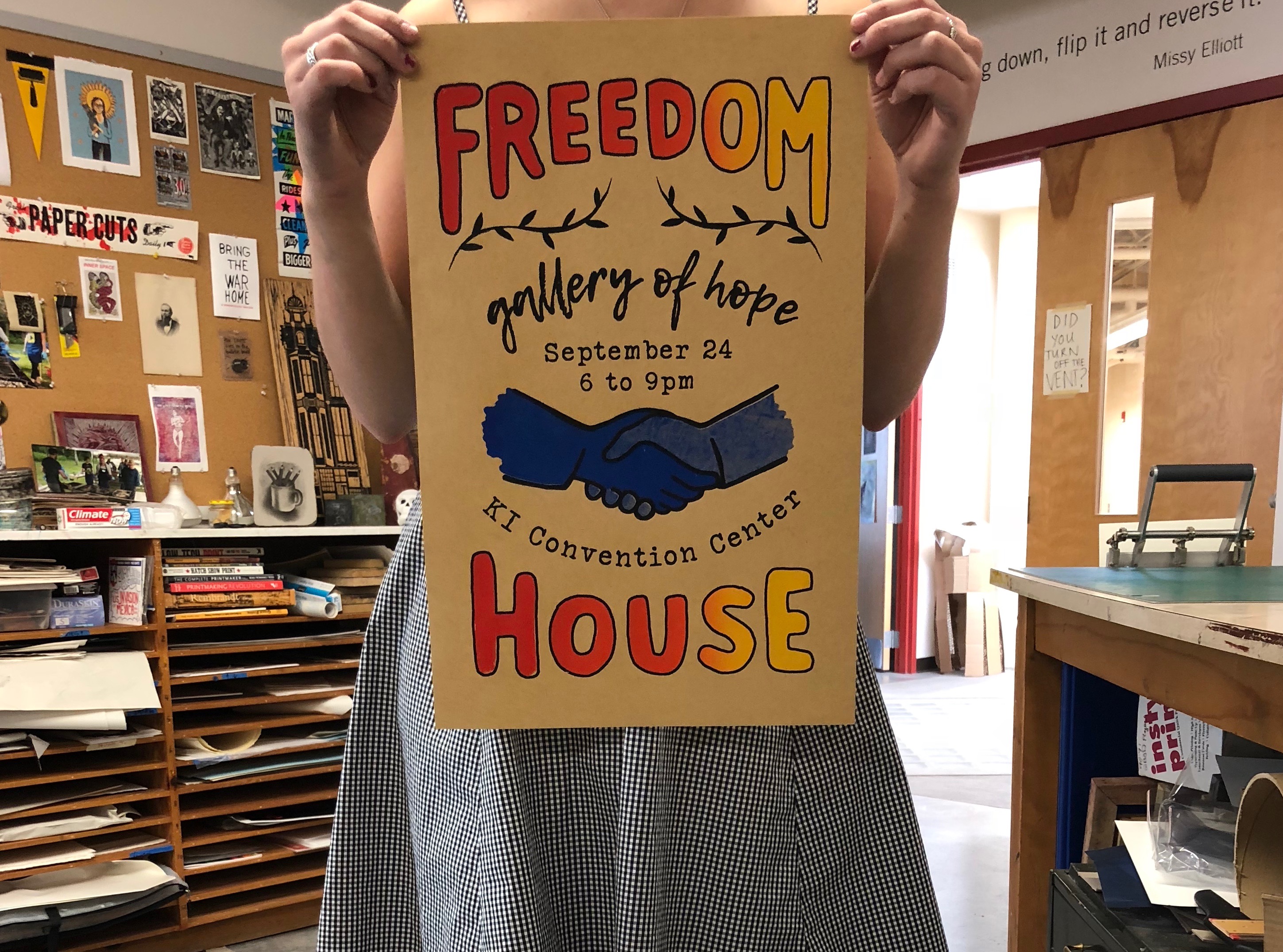
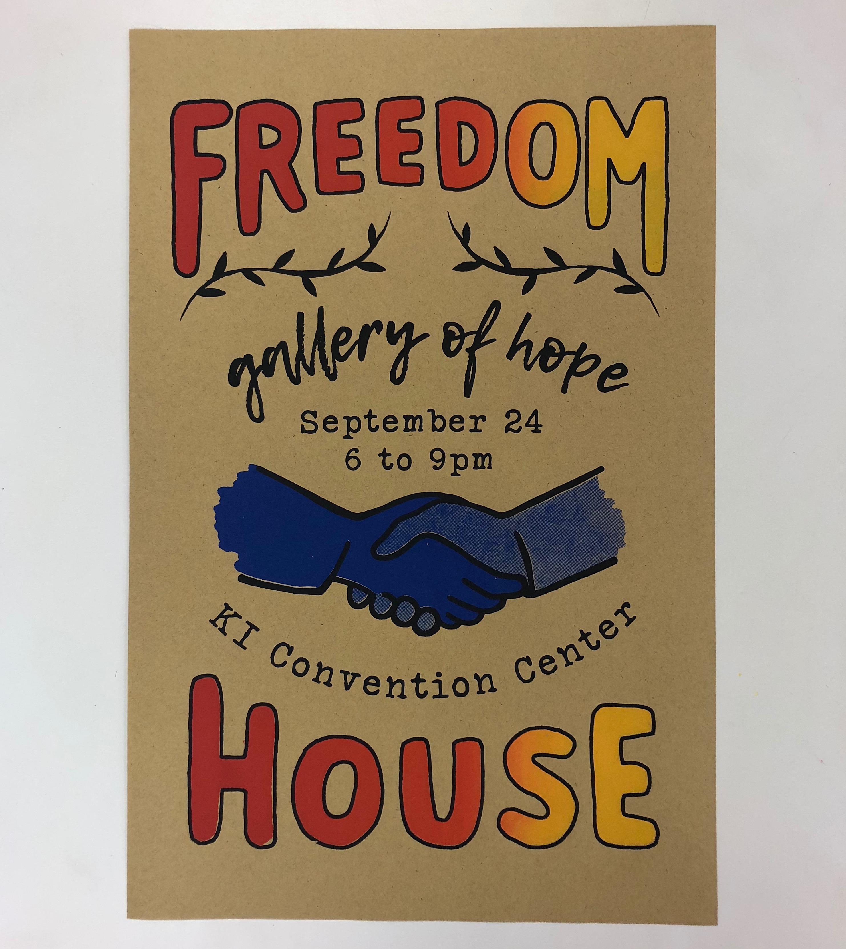
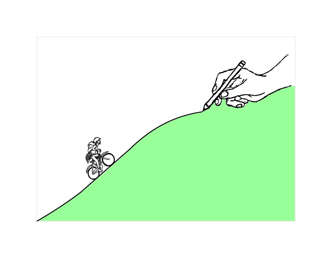
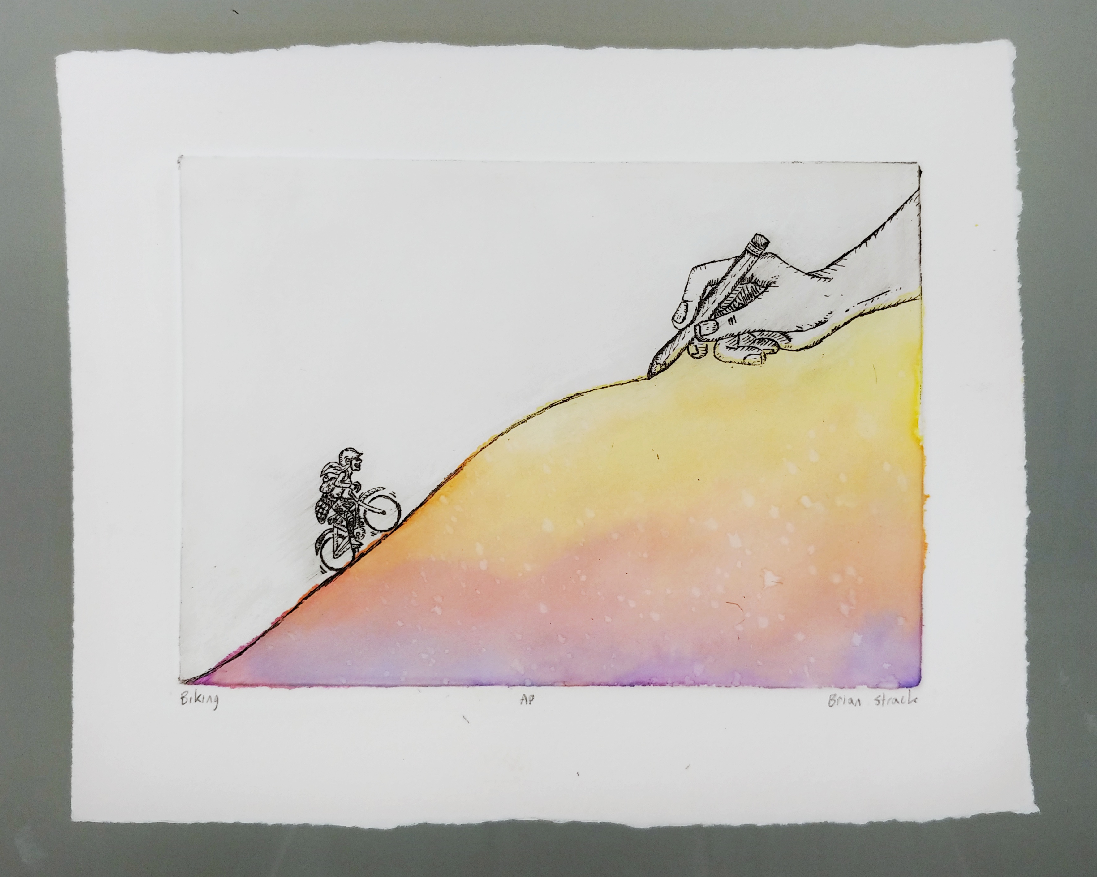
When I visited Freedom House I think the part that hit me was that these people didn’t choose to be in this position, and it was due to circumstances that were out of their control. The things life throws our way can just take us off the path we intended to follow. Being homeless was never on anyone’s plans and staying homeless is the one thing they all want to overcome. So for Freedom House, with those thoughts in mind, I wanted to create a piece that would be a visual for overcoming the difficulties that life can throw our way. A cyclist is featured smiling as she pedals up a steep hill that is being drawn by a hand. She is supposed to represent us and facing our challenges with positivity and the mentality that the end of the trouble is right over the horizon. This can be seen as the steepness of the hill begins to straighten out.

The hand can be interpreted as either God laying out your path or just life laying out obstacles. I wanted to leave that open to make it more accessible and relatable to anyone looking at it. The mission of Freedom House is related to Christian values so I did wanted to provide something that could align with their values. The size is also something I really liked. It comes out to 5×7 inches so it can be something you hold in your hands and look at. I like pieces that are small and precious, and those aspects really compliment the project overall and make the detail something you have to look for.

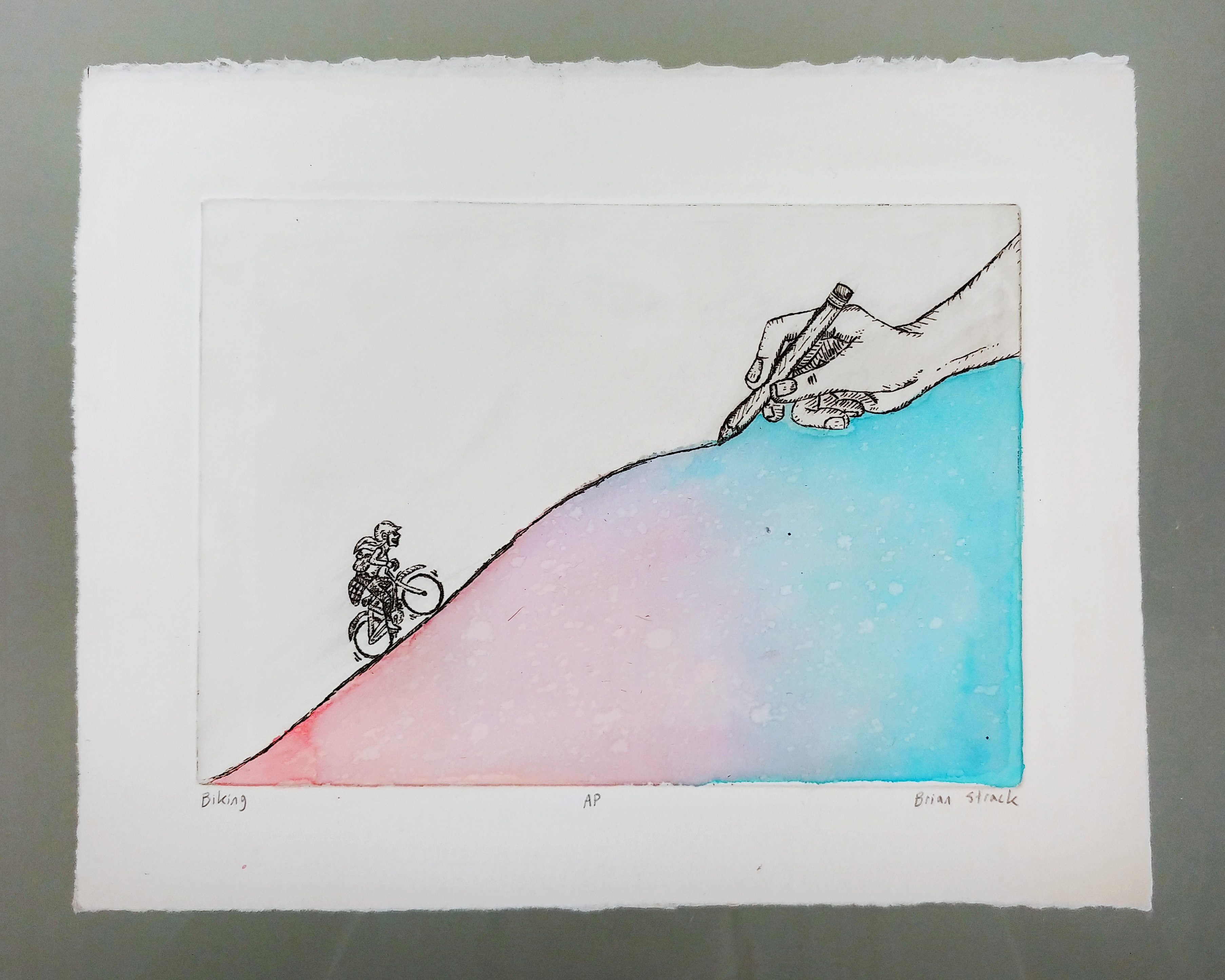
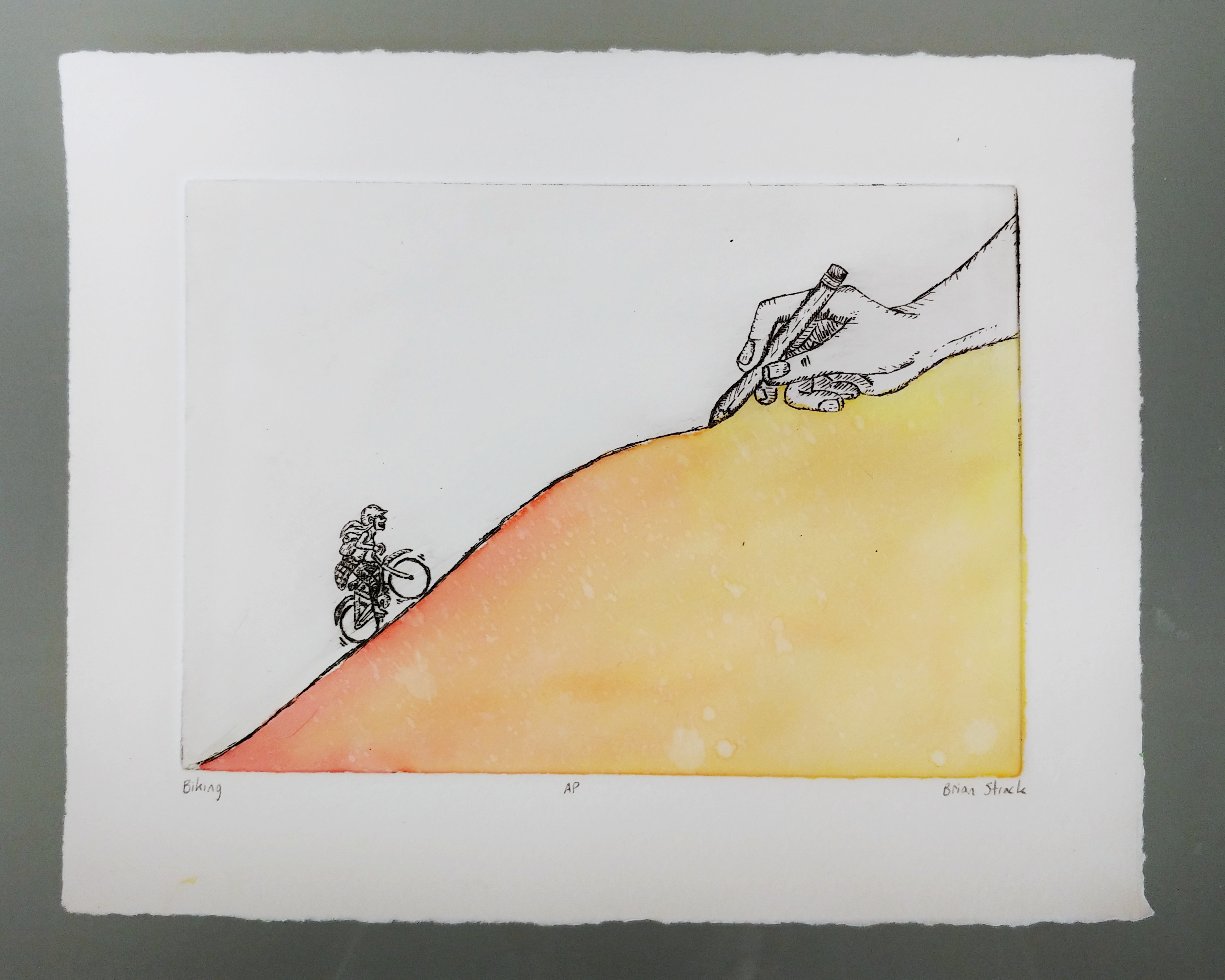
The coloring underneath was something fun to experiment with since it was my first time using watercolors since I was in elementary school. It was interesting to try out different colors and blends to achieve something that enhances the piece. It can be seen as an underlying beauty that the cyclist doesn’t see beneath her. Like a beautiful thing being created underneath her struggle up this hill.

In terms of an inspiration, I can’t really point to a single piece that really inspired it. The origin of the line the piece is based on, “God gave you what you can handle,” is from a song called “Biking.” I can say that the image of a hand as a representative of God also comes from all the Monty Python movies I’ve seen. The rest of is I would say came from seeing what looked best compositionally.

Gallery of Hope Promotion

This semester, our intermediate printmaking class worked with the non-profit organization, Freedom House. Freedom House is a homeless shelter for families located in Green Bay. Our final project in printmaking was to make a print that benefits Freedom House in some way. Freedom House stressed a need for promotional products for their annual Gallery of Hope event. The Gallery of Hope is a fundraiser dinner that showcases photographs relating to Freedom House’s mission. Lydia explained that the event starts our dark and confusing but the guests are led in to a beautiful space filled with color and light. Past logos for the event that the organization liked were full of color and used script font. I wanted to use some of those elements in the poster without using a specific logo itself.

I made 50 screen prints that had three layers each. I included a gradient from red to yellow so I could include multiple bright warm colors without adding an overwhelming amount of layers. On the poster is a pair of shaking hands. I decided to make these hands blue because not only does it add more color but blue is the color in the freedom house logo. The posters have Freedom House, Gallery of Hope, and the date, time, and location of the event. The posters were going to be displayed in local businesses. I wanted to create a sort of Etsy, DIY feel so the posters would not only fit well with the establishment but also catch the eye of customers. I am very pleased with how my prints turned out and am grateful to have made work that support’s Freedom House’s cause.


Final Project

This semester my intermediate printmaking class volunteered at Freedom House, a shelter that provides homeless families with shelter, food, and care. When touring, we recognized that Freedom House needed help with adding some art to their shared spaces and rooms. I believe that the introduction of art to this space would make it feel more like a home and somewhere the kids can enjoy more as well.

For my work at Freedom House, I took on the task of creating an intaglio print that can be produced in a large series and used to decorate. The print I created features a girl biking up a hill as it is drawn. Freedom House is a Christian organization so I wanted to create something that can be interpreted as religious, but can also be seen as relatable by secular guests. The hand can be interpreted as God or even just a symbol of life or destiny. I wanted to create something that acknowledges a struggle but stays uplifting by expressing the message that the struggle is manageable.

Freedom House also has an event called Gallery of Hope where they bring guests in for a dinner, an art auction, and to donate to Freedom House and their mission. I created five logo variation for this event. I haven’t made a logo for a one-night event before. The design they had previously was a script font with a gradient of colors. I wanted to offer them some designs that are symbols instead of text that could be versatile in the way they can be sized and placed on things. The logos I created range from symbolizing photography and giving to symbolizing Bible stories that relate to the even or the struggle of homelessness.

This project was a good challenge for me. Creating five different designs in such a small window of time is good practice for coming up with ideas. I also have not created a logo in a while so it was nice to get back into trying to condense designs into something simple that said more than it showed. The intaglio print is also refreshing because it’s a chance to step away from digital art, which I find myself doing the most. Having to deal with variables like ink density, paper placement, and printing press pressure makes art a lot more interesting than the perfect vacuum of Adobe Illustrator. The opportunity to create work for the purpose of helping people feel better in a situation they don’t like being in makes all the time spent fine-tuning and communicating back and forth feel less like work.

Final Project

Over the semester, I didn’t really find that working with Freedom House, a local homeless shelter, necessarily changed the work that I made for the final project. However, I have a collection of finished images and sketches on my computer, so I searched around for what I thought would be best to give to Freedom House and modified them going forward. I wanted to address the problem of the building looking a bit sterile, cold and outdated, therefore giving away prints that are much more optimistic and uplifting.


The first two prints are of a collage I made featuring Joseph Kittinger skydiving from the stratosphere along with some illustrations I made of outer space. While the two collections of prints are visually identical, one version has a blue background and the other is orange.


While I had previously heard of Project Excelsior, the event Kittinger was apart of, it wasn’t until I watched the music video for “Dayvan Cowboy” by Boards of Canada that I actually saw footage of the jump. I vividly remember being stunned while watching the video for the first time. Not only was I inspired by the beautiful music, but also the breathtaking archived cinematography. It was with this inspiration that I created my design.


The third collection of prints is an image I made earlier in the semester of a boy trying to catch a frog. I will give these to both to the Gallery of Hope, an event that Freedom House does to engage the community, and Freedom House itself.


I feel like all of the images that I’m giving to Freedom House for this final project have a sense of optimism and curiosity. While these are usually themes that I focus on in my pieces, I wanted these images to meet the staff’s need for inspiring and welcoming art. My hope is that the residents, particularly the children, find these pieces enjoyable and heartfelt.

My Time with the Freedom House

My experience working with the Freedom House thus far has been overall positive. It really made me think about the role that art and design can play in everyday spaces. I enjoyed being able to dovetail serving the Freedom House with making art because it showed me firsthand how art should be accessible to everybody. I believe making the Freedom House’s space more visually appealing has given our prints and design work a greater purpose. These are the first projects we’ve done as a class that are externally motivated; our creative processes have revolved around others and molding our work to serve the needs of someone other than ourselves. This is an important lesson to learn as a young designer, to practice creating work that solves problems for clients.

I’m hopeful that I am creating something not only that I am proud of, but that fulfills a need for the residents and employees. I am designing a template for the various signs and reminders around the house. Lydia, our volunteer coordinator, expressed to me that these are seen every day and are in need of an update. I’m putting together a visually appealing layout that will make these signs more unified and professional. I am also providing an easy-to-follow plan for recreating these signs in the future, as well as a supply of high quality paper, to keep them looking fresh.

In addition to my digital work, I am creating a printmaking related project for the Freedom House. I am making a screenprint for each residence as well as extras to be used as needed for the Gallery of Hope event. I am incorporating a fragment of the bible verse Philippians 4:13, “I can do all things through Him who gives me strength” for my design of the print; something that will relate to both the residents and employees. For time sake, my print has two or three layers, with only two to three colors, depending on choice of paper.


Freedom House Visit #3

My time working with Freedom House has really made me think about the important purposes art can serve outside of a gallery. As a design major, I am constantly aware of how important it is for promotional content to be done by a professional. I am also involved with volunteer work for non-profit organizations outside of Freedom House. I have been able to help organizations that can not afford to a hire a professional in doing small design jobs for them; such as logo work or posters. Freedom House was not only in need of design work, but art. Freedom House is focused on providing basic facilities and amenities for the homeless in the Green Bay community. This organization rightfully puts their time and resources into providing basic amenities for their guests to help them get back on their feet. Therefore, there is a lack of aesthetic components in the Freedom House facility. I think it’s important to have small bits of positive or beautiful reminders when experiencing the hardships of life. Little reminders of positivity help me work through hard times and I think being surrounded by positivity is something that helps everyone.

For my final project in Intermediate Printmaking, I am making a screenprint for Freedom House. The project I am currently working on, is a poster for Freedom House’s annual Gallery of Hope fundraiser. I am creating 20-30 posters that promote the event. When talking to Lydia, she stressed the importance of incorporating color and art in their Gallery of Hope brand. I intend to add a split fountain on the poster so I can include multiple colors in less layers. In addition, I want the title of Gallery of Hope itself to have a hand written script feel because Lydia enjoyed that aspect of previous Gallery of Hope logos.

These posters will be displayed in local businesses. My intention for these posters is to capture the eye of the public and interest people in helping Freedom House within their means. Whether it’s attending the Gallery of Hope, donating, volunteering, or just telling friends — all contribution would significantly help out Freedom House! I am glad this class had allowed me to use my skills in printmaking to make work for a good cause.

Fourth Freedom House Work Day

For the fourth “visit” for Freedom House, I worked on screenprinting my prints for the final project. I have been able to get a lot done up until now, even being able to print over spring break to get ahead. I had a lot of fun bringing along a friend of mine to assist me in screenprinting the first layer and exposing the screens. While he was new to this process, I was happy to have assistance in printing, exposing the screens and cleaning. Bringing along my friend ultimately helped to make the process go by much faster. I think that this would be a great idea in the future when I continue to screenprint outside of class.

While I have successfully printed the first layers (as there will be a variant edition), I have had trouble two separate days trying to print with the black ink, which is my main image. It seems like the ink is too old. Although I thought this issue may have been due to my image being too complex (since I used a lot of small halftones), the ink is not able to even go through continuous exposed areas of the screen without eventually clogging. I tried using a chemical retarder in the ink in order for it to not clog up as much, but that didn’t do anything.

My plan going forward is to troubleshoot printing with the black ink with Katie during class tomorrow. With that in mind, I hope to finish all of the prints before the end of the day tomorrow as well as have them all signed and numbered!

Final Proposal

Description

To finish Art 330 on a strong note, I plan on having essentially three different prints to give to Freedom House, either to give to the residents there or for their gallery of hope.


The first two prints will be a screenprinted collage I made of Joseph Kittinger skydiving from the stratosphere combined with some illustrations I made of the sun and stars. While I had previously heard of Project Excelsior due to the album made by Adam Young, it wasn’t until I watched the music video for “Dayvan Cowboy” by Boards of Canada that I actually saw footage of the jump. I vividly remember getting chills while watching the video for the first time, not only inspired by the beautiful music, but by the breathtaking archived cinematography as well. It was with this inspiration that I created my design, which I am excited to finish screenprinting and giving to Freedom House for some of their residents to have.


While the two prints will be very identical visually, one version will have a blue background while the other one will be red. I plan on making an edition of 15 for each of these prints, giving about seven of each kind to Freedom House.


The third print will be of an image I made earlier in the semester of a boy trying to catch a frog. Since the image has a lot of layers and would take quite a bit longer than my Joseph Kittinger prints (which already has taken a lot of time), I plan on printing digital copies of this poster to give not only to the residents, but for the Gallery of Hope that Freedom House is doing.


Schedule

April 3rd: Work on printing red layer

April 5th: Print black layer

April 6th: Sign, date & title prints. Send in “boy with frog” print to digital print center.

April 10th: Pick up digital prints

April 19th: Drop off prints to Lydia

Freedom House Visit 3

Sarah and I went to Freedom House to meet with Lydia about possible design projects for their events. Since Lydia was having a meeting at 10 we spent the first half of our visit cleaning the bathrooms. Emerson and Noah also made it and basically did the same thing, but we split into two teams to cover each bathroom. A notable occurrence during this was when I almost carried the water-filled mop bucket down a flight of stairs, but I was happy to find that the elevator was right next to me the entire time. After cleaning the bathrooms we met with Lydia in her office, which was filled with turtles. I think I thought to myself “if there’s a logo competition, I could incorporate a turtle and have a pretty good chance of winning.” The event she wants a logo and media kit for is called Gallery of Hope, and from the pictures, I saw from last year’s even they only have, or primarily have photography. I think that for my design for the logo I am going to try and have something that could imply more about the gallery instead of just flashy type. It is always a really fun process to try and deconstruct symbols and reconstruct them into simple logos. Based on what they used last year and the year before that they are using more complicated and flashy logos, so it will be interesting to see how they react to something simpler and more like an icon. I will probably email Lydia and ask more about what happens during the event so my logo can be more incorporated into what the event does and is. I haven’t done a logo for someone in a while so I’m excited to see what I’ll be able to come up with because I’ve been doing a lot more drawing and developing my style lately.

Freedom House Visit 2

During my second visit to Freedom House, Sarah and I went to help with whatever tasks they wanted us to do. We ended up getting to clean the dining room. It was probably the most thorough job I’ve ever done cleaning a dining room. In the hectic swamp that is my on-campus home, I don’t get a lot of opportunities to do any heavy duty cleaning, but I found the experience pretty nice and therapeutic. With all the mental effort needed for my job and class, it’s nice to take some time and do some mindless chores. Being in the dining room that long really got me to take in the environment and see how small and plain it really was. It would be nice if there was something we could add to make it homier since I think the dining table is the best place for a family to bond in a home. They already try to set up a similar vibe using their “no cell phones in this room” policy during meals. Going a bit further could involve different curtain, maybe an artificial smell for the room, and even a way to light the room differently. I think that finding ways to contribute to the atmosphere could help make it matter less what’s on the plate in front of them and bring out the people around them instead. I would not mind at all going back to do any more cleaning since there’s something nice about it when you don’t do it for yourself too often. It also helped me understand a room and it needs more than the initial visit would allow. I think the only aspect missing from my understanding of the dining room is what it actually looks like in action because right now everything about how it operated for me is just an assumption.